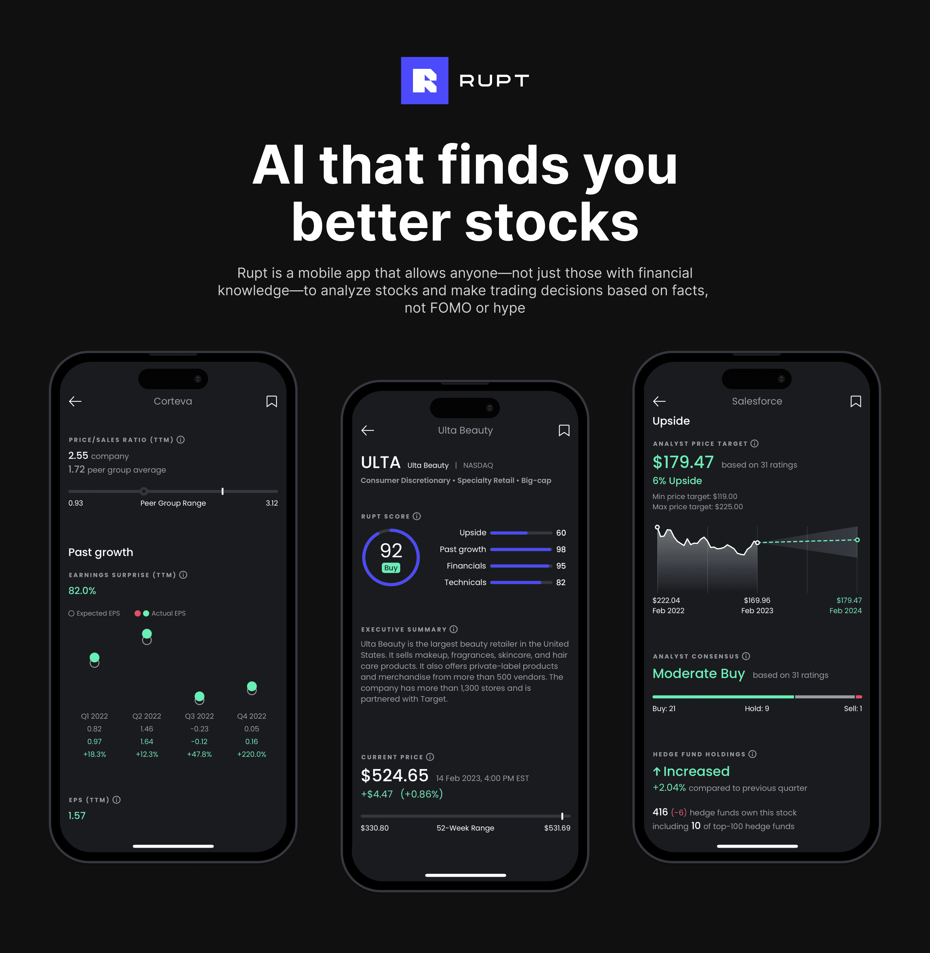
Rupt is a stock analysis app for amateur investors, a must-have companion for their Robinhood portfolios. It's like having a personal stock analyst at your fingertips who understands the market data and turns it into simple insights.
I am a co-founder of Rupt and I've been on the project since day one, leading all the product design work, helping shape the idea into a reality and seeing it through to launch and beyond.
My role:
UX Strategy
UX Research
UI Design
UX Writing
Information Architecture
Process overview
Process overview
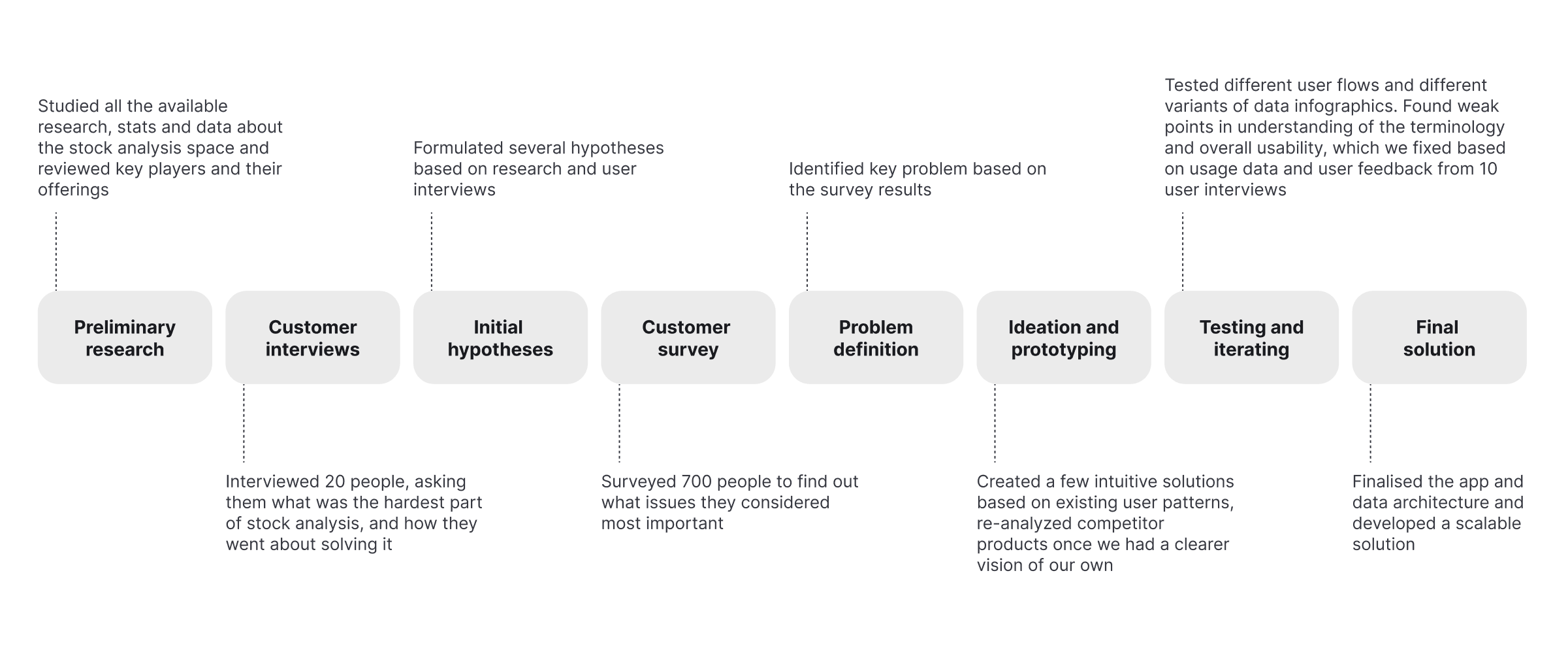
I will not bore you with the detailed description of every single task I performed during the project. Below are key highlights, insights and lessons learned.
I will not bore you with the detailed description of every single task I performed during the project. Below are key highlights, insights and lessons learned.
The challenge
Robinhood, the app that made commission-free stock trading possible for everyone, has caused an unprecedented rise in the number of amateur investors in the stock market. In 2020 alone, 10 million individuals joined the stock market. By 2021, there were 100 million user accounts at top online brokerages in the US. Although amateur investors enjoyed impressive initial gains during the covid pandemic, by 2022 they lost all the money they made.
10M
new brokerage accounts were opened by individuals in the US in 2020
100M
The number of user accounts at top online brokerages in the US in 2021
Source: JMP Securities, Bloomberg, Morgan Stanley
During my initial research into the stock market, I found two things that surprised me:
• US brokerage firms reported that more than 20% of all trades by individual investors were executed using mobile devices, which is completely different from the "classic" image of a trader sitting at his desk with six monitors covered in graphs and charts. "Classic" stock traders have several monitors for a reason—to look at lots of indicators simultaneously and synthesize all this data. Mobile users who do their research on smartphones, where screen space is limited, can't do this. We might have to do it for them.
• 35% of Robinhood users' net buying was concentrated in just 10 stocks, which meant they were severely influenced by attention-induced trading and "herd mentality". Instead of doing their own analysis and having a strategy and principles to follow, they were following the hype and trading by analogy.
During my initial research into the stock market, I found two things that surprised me:
US brokerage firms reported that more than 20% of all trades by individual investors were executed using mobile devices, which is completely different from the "classic" image of a trader sitting at his desk with six monitors covered in graphs and charts. "Classic" stock traders have several monitors for a reason—to look at lots of indicators simultaneously and synthesize all this data. Mobile users who do their research on smartphones, where screen space is limited, can't do this. We might have to do it for them.
35% of Robinhood users' net buying was concentrated in just 10 stocks, which meant they were severely influenced by attention-induced trading and "herd mentality". Instead of doing their own analysis and having a strategy and principles to follow, they were following the hype and trading by analogy.
During my initial research into the stock market, I found two things that surprised me:
• US brokerage firms reported that more than 20% of all trades by individual investors were executed using mobile devices, which is completely different from the "classic" image of a trader sitting at his desk with six monitors covered in graphs and charts. "Classic" stock traders have several monitors for a reason—to look at lots of indicators simultaneously and synthesize all this data. Mobile users who do their research on smartphones, where screen space is limited, can't do this. We might have to do it for them.
• 35% of Robinhood users' net buying was concentrated in just 10 stocks, which meant they were severely influenced by attention-induced trading and "herd mentality". Instead of doing their own analysis and having a strategy and principles to follow, they were following the hype and trading by analogy.
20%
of all trades by retail investors were executed using mobile devices
35%
of Robinhood users' net buying was concentrated in just 10 stocks
Source: Journal of Finance, Bloomberg, Seeking Alpha
Our team decided to build a mobile-first tool that would allow anyone—not just those with financial knowledge—to analyze stocks and trade based on facts, not FOMO or hype
Our team decided to build a mobile-first tool that would allow anyone—not just those with financial knowledge—to analyze stocks and trade based on facts, not FOMO or hype
Problem definition
After reading and discussing available research on the stock market and amateur traders, I was ready to talk to the traders themselves. During the 20 initial interviews, I didn't tell users that we wanted to build a stock analysis app until I absolutely had to. Instead, I asked about their frustrations with stock analysis and trading in an unprompted way. I also wanted to know whether they were willing to do something about these problems, what were they doing, and whether it was working for them.
After 20 interviews, I began to notice a pattern in responses and synthesized my learnings into several hypotheses. Each of the hypotheses could take our product in a very different direction. We as a founding team needed to take a stand on which issues we were going to focus on. To help us decide, I suggested to circle back to quantitative research.
There also were several risky assumptions about the business model that we needed to validate. We expected our tool to cost about $300 per year. If your brokerage account size was $3,000 and you expected to earn 10% per year on your investments, using our tool would not make sense for you. It was one of the things that could make or break the whole business, and that's another reason why I knew the quantitative study made sense.
There also were several risky assumptions about the business model that we needed to validate. We expected our tool to cost about $300 per year. If your brokerage account size was $3,000 and you expected to earn 10% per year on your investments, using our tool would not make sense for you. It was one of the things that could make or break the whole business, and that's another reason why I knew the quantitative study made sense.
I conducted a survey of 700 amateur investors in the United States. The results of the study were consistent, and this gave me the confidence to focus on one key area:
Amateur investors lack specific knowledge to interpret the stock market data and are confused by conflicting expert opinions
I conducted a survey of 700 amateur investors in the United States. The results of the study were consistent, and this gave me the confidence to focus on one key area:
Amateur investors lack specific knowledge to interpret the stock market data and are confused by conflicting expert opinions
The solution
Now that we had decided we would focus on helping amateur investors make sense of the market data, we had to figure out how exactly we could do it. I took a closer look at existing tools to understand why they were not doing the job.
When choosing stocks for your portfolio, you usually have to use a stock screener. A typical stock screener forces you to make decisions on which metrics to filter the thousands of stocks available on the market. But how do you know which metrics are the most important? No wonder so many people were choosing to buy the same 10 stocks that their friends were buying.
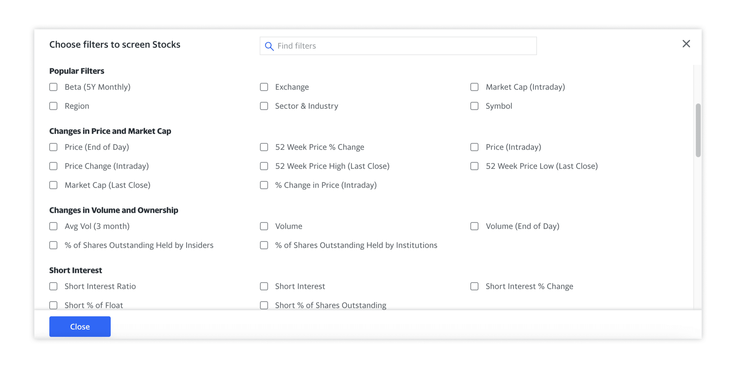
An example of a typical stock screener
Besides knowing which metrics are important, you also need to be able to interpret their values. For example, is a 12% profit margin good or bad? Well, it's definitely better than zero. But how much better? It's almost impossible to answer without a frame of reference. For a software business that wouldn't be impressive at all, but a 12% profit margin at an airline would be absolutely fantastic!
Even the users who knew what to look for and how to interpret the numbers found this process tedious and time-consuming, limiting the number of stocks they could examine in a given day.
Existing stock analysis tools required a lot of time for tedious data interpretation and forced users to take decisions for which they lacked specific knowledge
Existing stock analysis tools required a lot of time for tedious data interpretation and forced users to take decisions for which they lacked specific knowledge
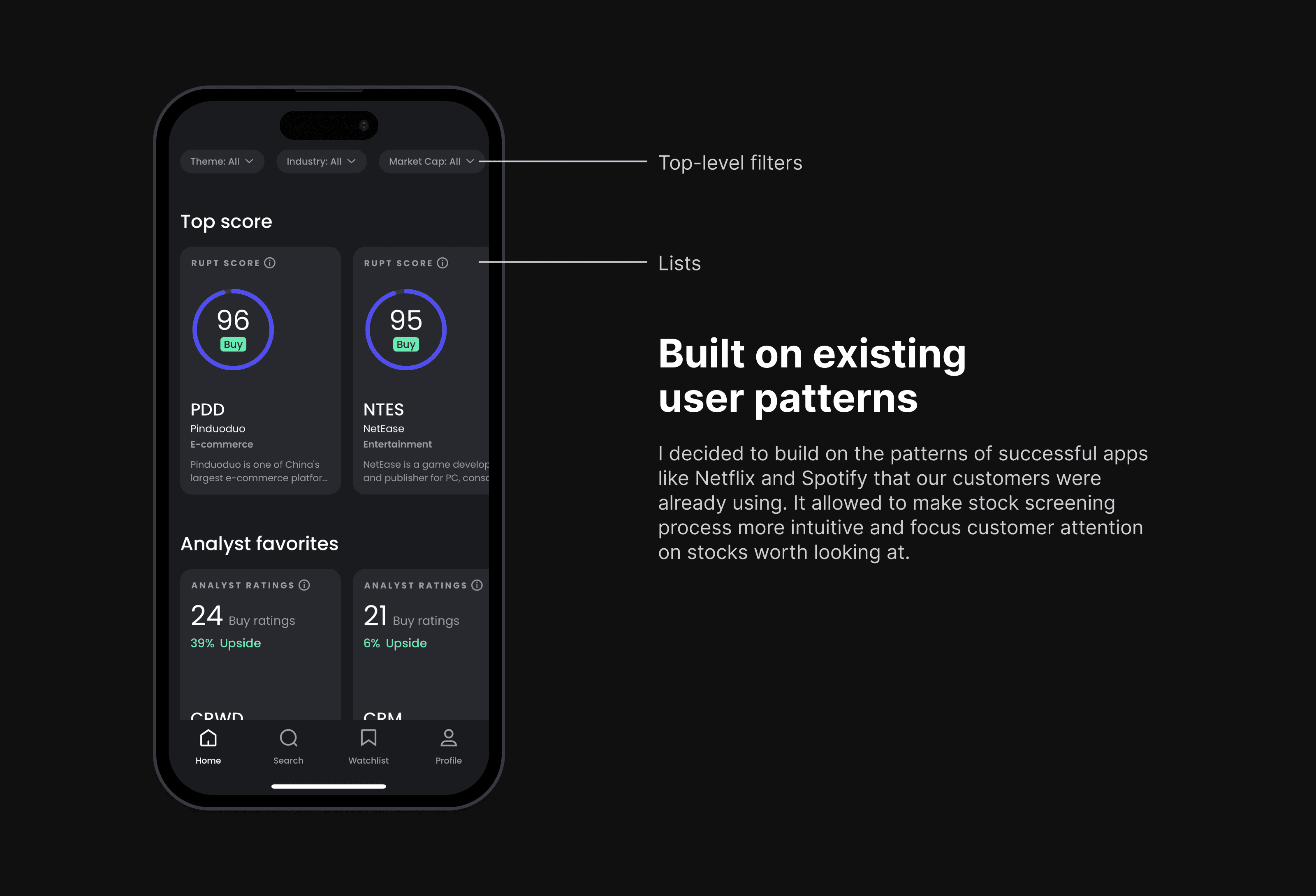
It was clear that amateur traders needed more prompts and suggestions in the stock discovery process. I decided to build on the patterns of successful apps like Netflix and Spotify that they were already using. It allowed to make stock screening process more intuitive and focus customer attention on stocks worth looking at.
It was clear that amateur traders needed more prompts and suggestions in the stock discovery process. I decided to build on the patterns of successful apps like Netflix and Spotify that they were already using. It allowed to make stock screening process more intuitive and focus customer attention on stocks worth looking at.
We made stock discovery a pleasant journey instead of a tedious task by drawing on users' existing patterns
We made stock discovery a pleasant journey instead of a tedious task by drawing on users' existing patterns
It would have been great to be able to choose stocks like we choose TV shows on Netflix. However, there was one small problem: we had to figure out which stocks were worth looking at. This also had to be based on the hard data, not popularity, FOMO or peer influence.
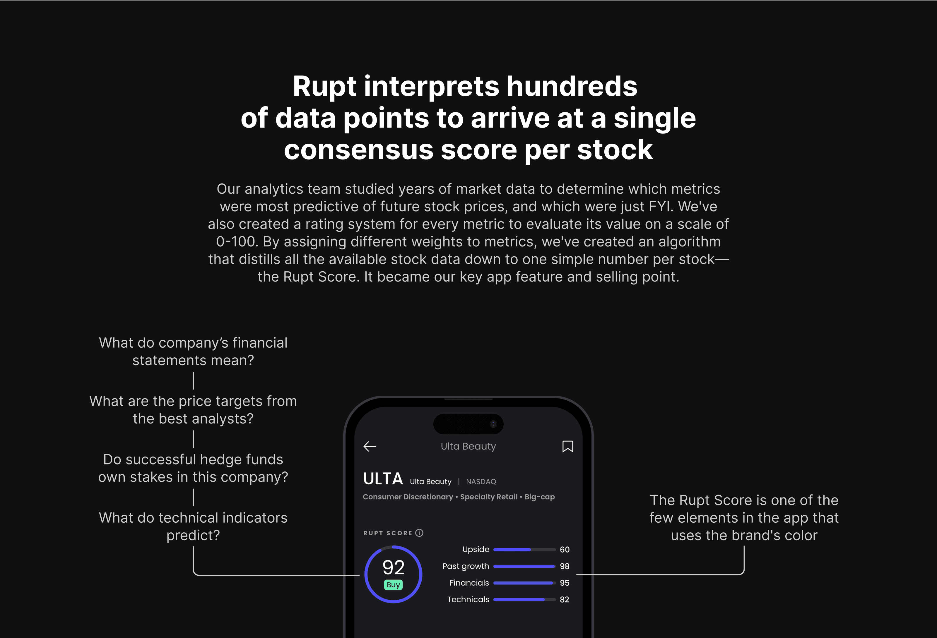
Our analytics team studied years of market data to determine which metrics had a strong correlation with future stock prices, and which metrics were just FYI.
We've also created a rating system for every metric to determine what its absolute value meant on a scale of 0-100 (0 meaning terrible and 100 being great). These detailed ratings worked for us on the background, allowing us to assign them weights and create an algorithm that would distill all the available stock data down to one simple number per stock – the Rupt Score. It became our key app feature and selling point.
The consensus score was recalculated with every new data point, which meant users always had a fresh snapshot of the market and stock standings.
It would have been great to be able to choose stocks like we choose TV shows on Netflix. However, there was one small problem: we had to figure out which stocks were worth looking at. This also had to be based on the hard data, not popularity, FOMO or peer influence.
Our analytics team studied years of market data to determine which metrics had a strong correlation with future stock prices, and which metrics were just FYI.
We've also created a rating system for every metric to determine what its absolute value meant on a scale of 0-100 (0 meaning terrible and 100 being great). These detailed ratings worked for us on the background, allowing us to assign them weights and create an algorithm that would distill all the available stock data down to one simple number per stock – the Rupt Score. It became our key app feature and selling point.
The consensus score was recalculated with every new data point, which meant users always had a fresh snapshot of the market and stock standings.
Our team created an algorithm that interpreted hundreds of data points to arrive at a single consensus score per stock—the Rupt Score. It used hard data to drive user attention, not hype, FOMO or peer influence.
Our team created an algorithm that interpreted hundreds of data points to arrive at a single consensus score per stock—the Rupt Score. It used hard data to drive user attention, not hype, FOMO or peer influence.
We did not invent the consensus score, of course. However, we did make it look that exact way for a reason. While looking at other apps with consensus scores, we found several drawbacks that we wanted to address.
We did not invent the consensus score, of course. However, we did make it look that exact way for a reason. While looking at other apps with consensus scores, we found several drawbacks that we wanted to address.
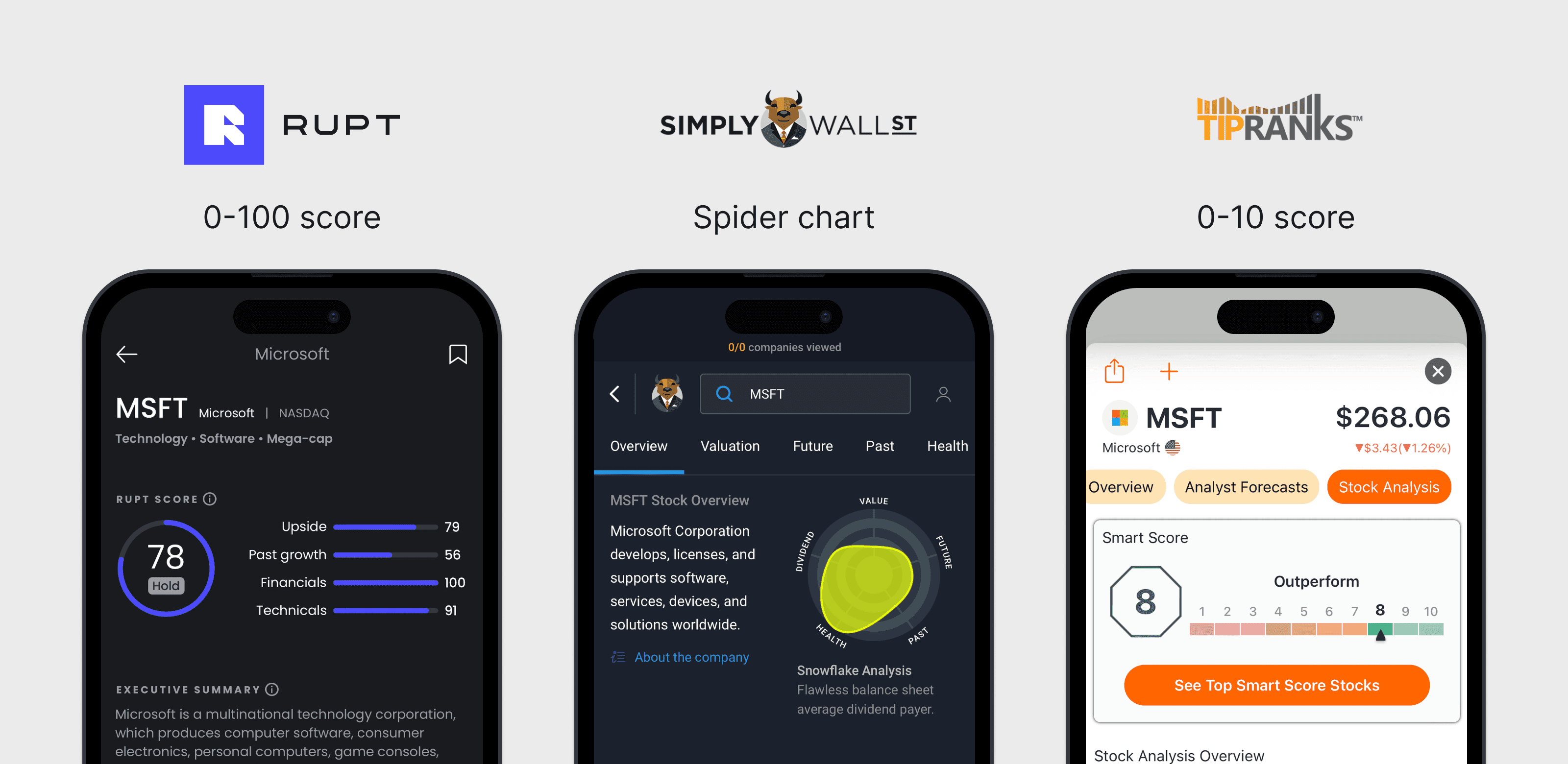
Simply Wall St: Spider chart
From my years of working as a strategy consultant, I have one main insight about spider charts: they always confuse people. Also, it is impossible to sort or compare stocks according to these parameters. How do you know which stock is better—the one with better Future or the one with better Value?
TipRanks: 0-10 score
This seems like a plausible and a simpler alternative to our 0-100 score. But there's a catch: there are 6000+ stocks listed on the NYSE and Nasdaq in 2022, so there are hundreds of stocks that get a rating of ten from TipRanks. As an average amateur investor, I don't have money to buy hundreds of stocks—I'd probably settle for 20-30 stocks max in my portfolio. So how do I determine which 20 of those ten-rated stocks are the best ones? That's where a more detailed score comes in handy.
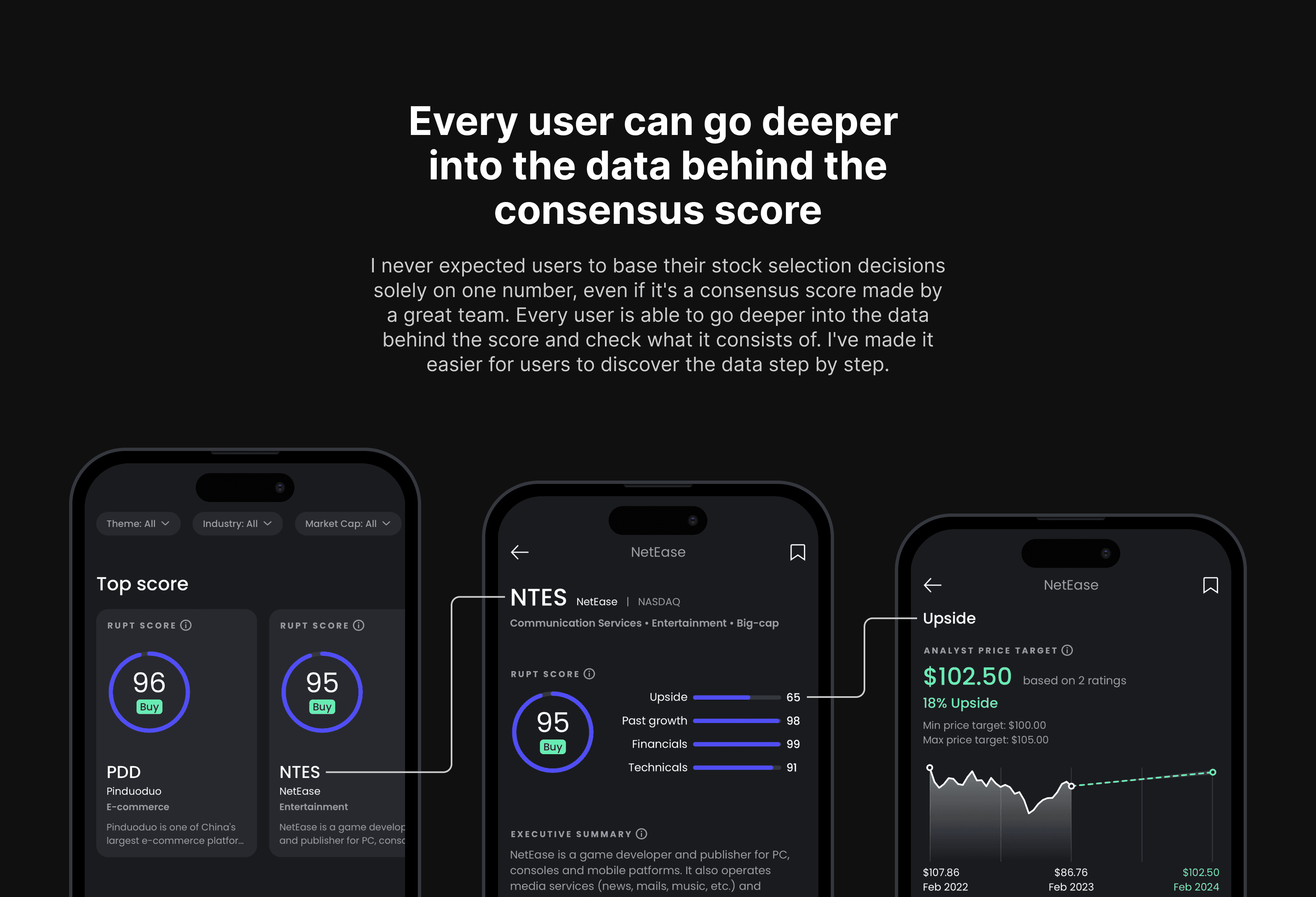
I worked with the analytics team from the start to create several levels of data, making it easier for users to discover it step by step. Having data hierarchy was also important because of the mobile-first nature of the tool with a limited screen space.
I worked with the analytics team from the start to create several levels of data, making it easier for users to discover it step by step. Having data hierarchy was also important because of the mobile-first nature of the tool with a limited screen space.
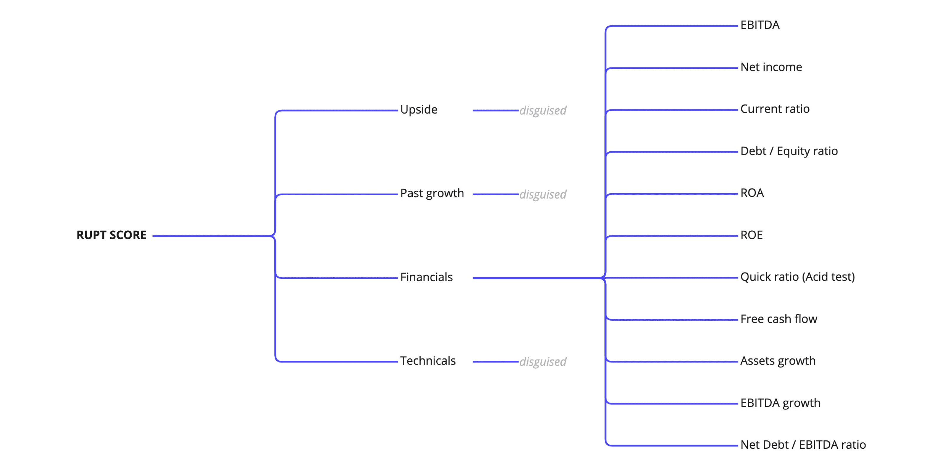
I worked with the analytics team from the start to create several levels of data, making it easier for users to discover it step by step. Different levels of data are also useful for creating and sorting various stock lists within the app.
I worked with the analytics team from the start to create several levels of data, making it easier for users to discover it step by step. Different levels of data are also useful for creating and sorting various stock lists within the app.
Conclusions
While I was working on Rupt, I came up with a set of principles that guided my decisions on user experiences within the app. Some of these rules might seem obvious, but they're important and are still worth stating.
Start with the user's needs, not your app's architecture. This one is kind of obvious, and it's even not that hard to follow when you're starting from scratch. But when you're iterating on an existing app, it's easy to make only small changes that don't require changes in your architecture, and end up with subpar user experiences. Needles to say, app architecture needs to be flexible and should be the consequence of the needed user experience, not the driver. In Rupt, we initially had search embedded within the Home tab but understood that discovery and search were two very different modes so we put search in a separate tab.
Data hierarchy. The app is designed to provide data in levels, moving from more abstract to more concrete. This decision was mainly driven by user experiences, and as analytics team worked in parallel with me, constant coordination was very important to avoid rework on both ends. Having data hierarchy was also important because of the mobile-first nature of the tool: screen space is limited, and you can't look at lots of indicators simultaneously and synthesize all the data; several pieces of data should be able to tell more or less complete story at any given moment.
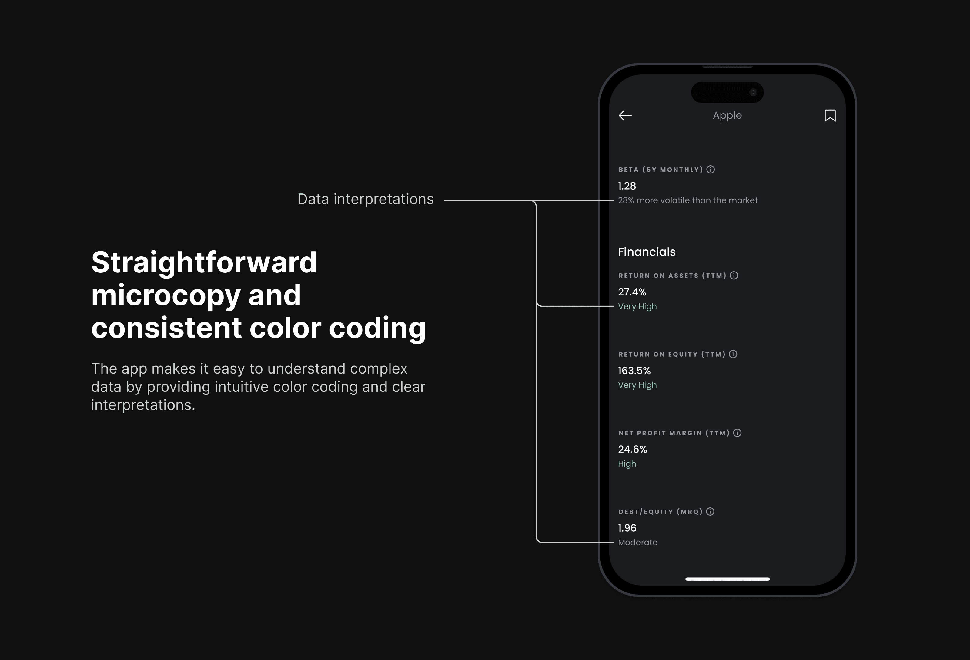
Data interpretation. When possible, metrics should be accompanied by an interpretation. We use a simple system to explain financial data by adding a label next to each value: very low, low, moderate, high or very high, and we color code these labels for ease of comprehension. This makes it easy to understand what's going on at a glance without having to carefully examine each metric in detail.
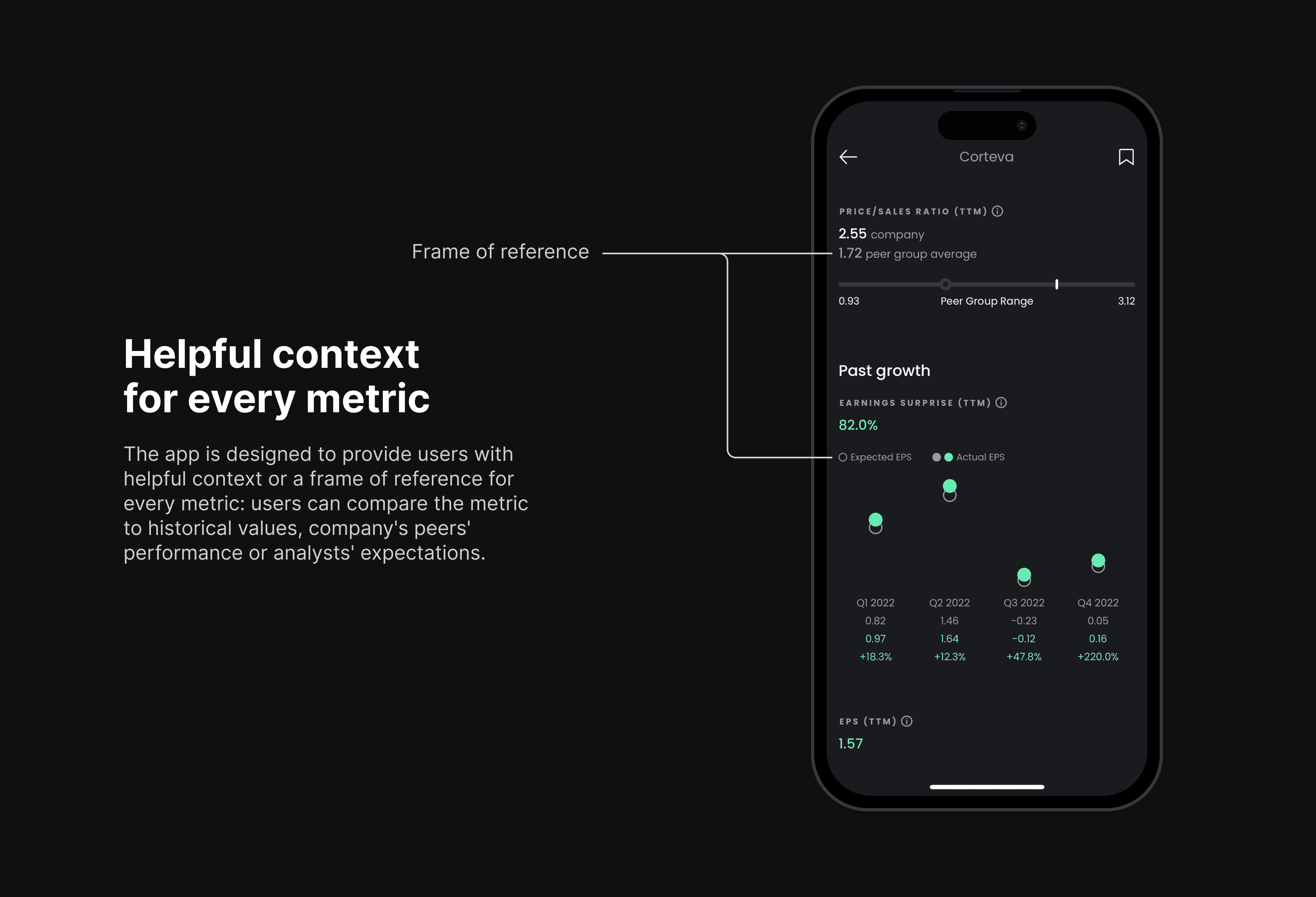
Frame of reference. I provide users with a frame of reference for each metric, so they can compare the metric to its historical values, company's peers' performance or analysts' expectations.
Consistent color coding. Color coding can be tricky and is easily overdone. It's important to use the right colors for the right data and to stick with a few colors throughout the app. I've purposefully used gray for neutral data: it looks better and is better interpreted by users, who tend to put yellow in the same bucket with red—in other words, seeing it as a warning. I also use the brand's color sparingly, keeping it only for the Rupt Score (the central feature of the app) and a few highlights.
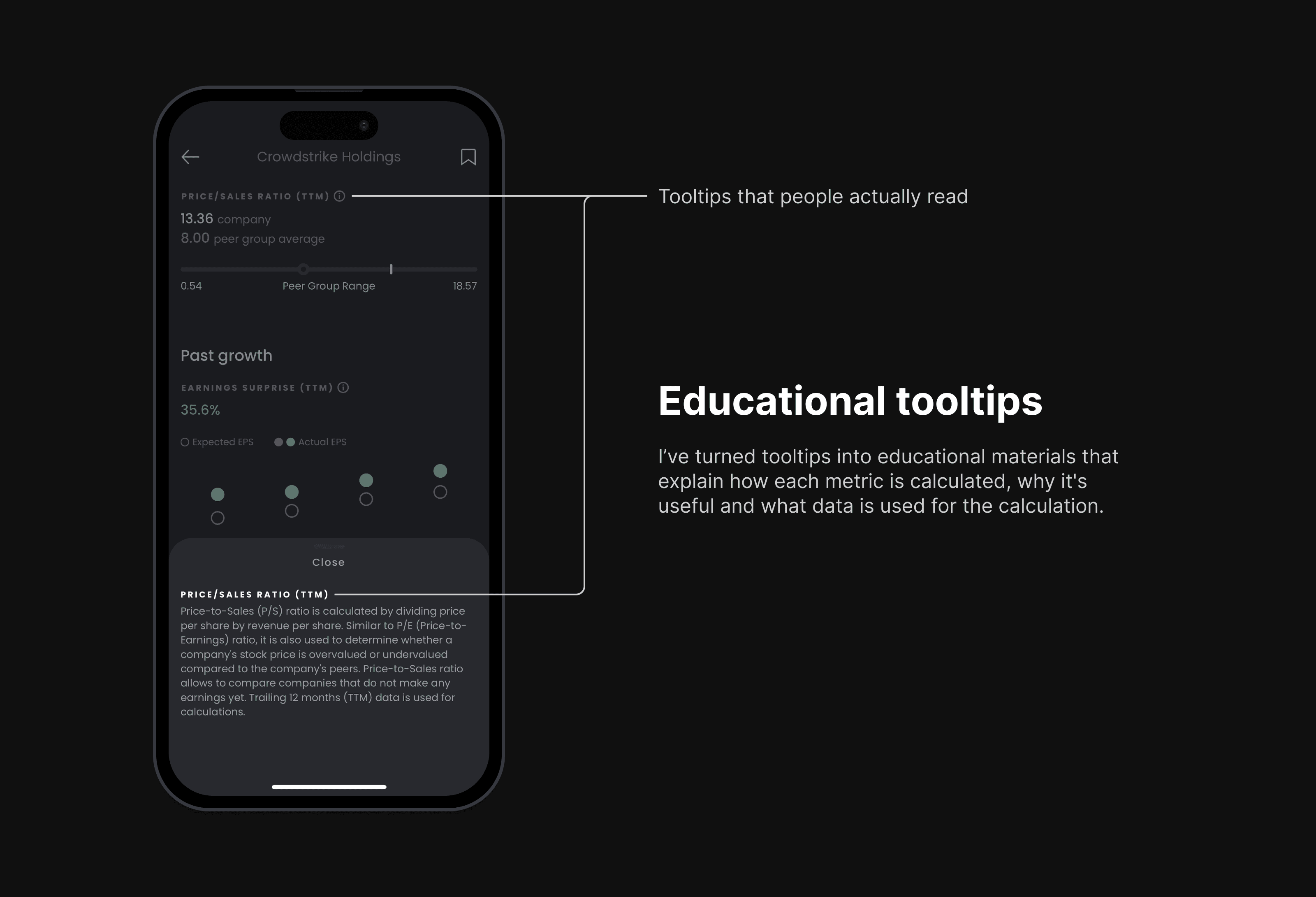
Simpler is better, but not always shorter. It's easy to compromise clarity for the sake of simplicity in the user interface. Our audience lacked specific knowledge about the complex data being presented, so I deliberately made some of my UX copy longer to make it very clear what was going on there.
Conclusions
While I was working on Rupt, I came up with a set of principles that guided my decisions on user experiences within the app. Some of these rules might seem obvious, but they're important and are still worth stating.
Start with the user's needs, not your app's architecture. This one is kind of obvious, and it's even not that hard to follow when you're starting from scratch. But when you're iterating on an existing app, it's easy to make only small changes that don't require changes in your architecture, and end up with subpar user experiences. Needles to say, app architecture needs to be flexible and should be the consequence of the needed user experience, not the driver. In Rupt, we initially had search embedded within the Home tab but understood that discovery and search were two very different modes so we put search in a separate tab.
Data hierarchy. The app is designed to provide data in levels, moving from more abstract to more concrete. This decision was mainly driven by user experiences, and as analytics team worked in parallel with me, constant coordination was very important to avoid rework on both ends. Having data hierarchy was also important because of the mobile-first nature of the tool: screen space is limited, and you can't look at lots of indicators simultaneously and synthesize all the data; several pieces of data should be able to tell more or less complete story at any given moment.
Data interpretation. When possible, metrics should be accompanied by an interpretation. We use a simple system to explain financial data by adding a label next to each value: very low, low, moderate, high or very high, and we color code these labels for ease of comprehension. This makes it easy to understand what's going on at a glance without having to carefully examine each metric in detail.
Frame of reference. I provide users with a frame of reference for each metric, so they can compare the metric to its historical values, company's peers' performance or analysts' expectations.
Consistent color coding. Color coding can be tricky and is easily overdone. It's important to use the right colors for the right data and to stick with a few colors throughout the app. I've purposefully used gray for neutral data: it looks better and is better interpreted by users, who tend to put yellow in the same bucket with red—in other words, seeing it as a warning. I also use the brand's color sparingly, keeping it only for the Rupt Score (the central feature of the app) and a few highlights.
Simpler is better, but not always shorter. It's easy to compromise clarity for the sake of simplicity in the user interface. Our audience lacked specific knowledge about the complex data being presented, so I deliberately made some of my UX copy longer to make it very clear what was going on there.